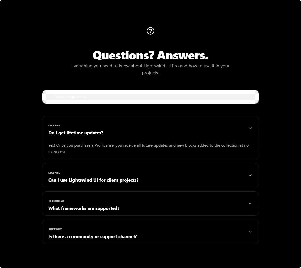
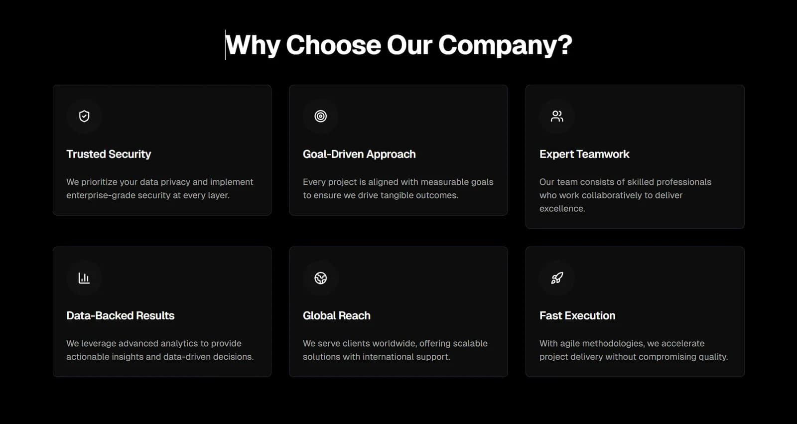
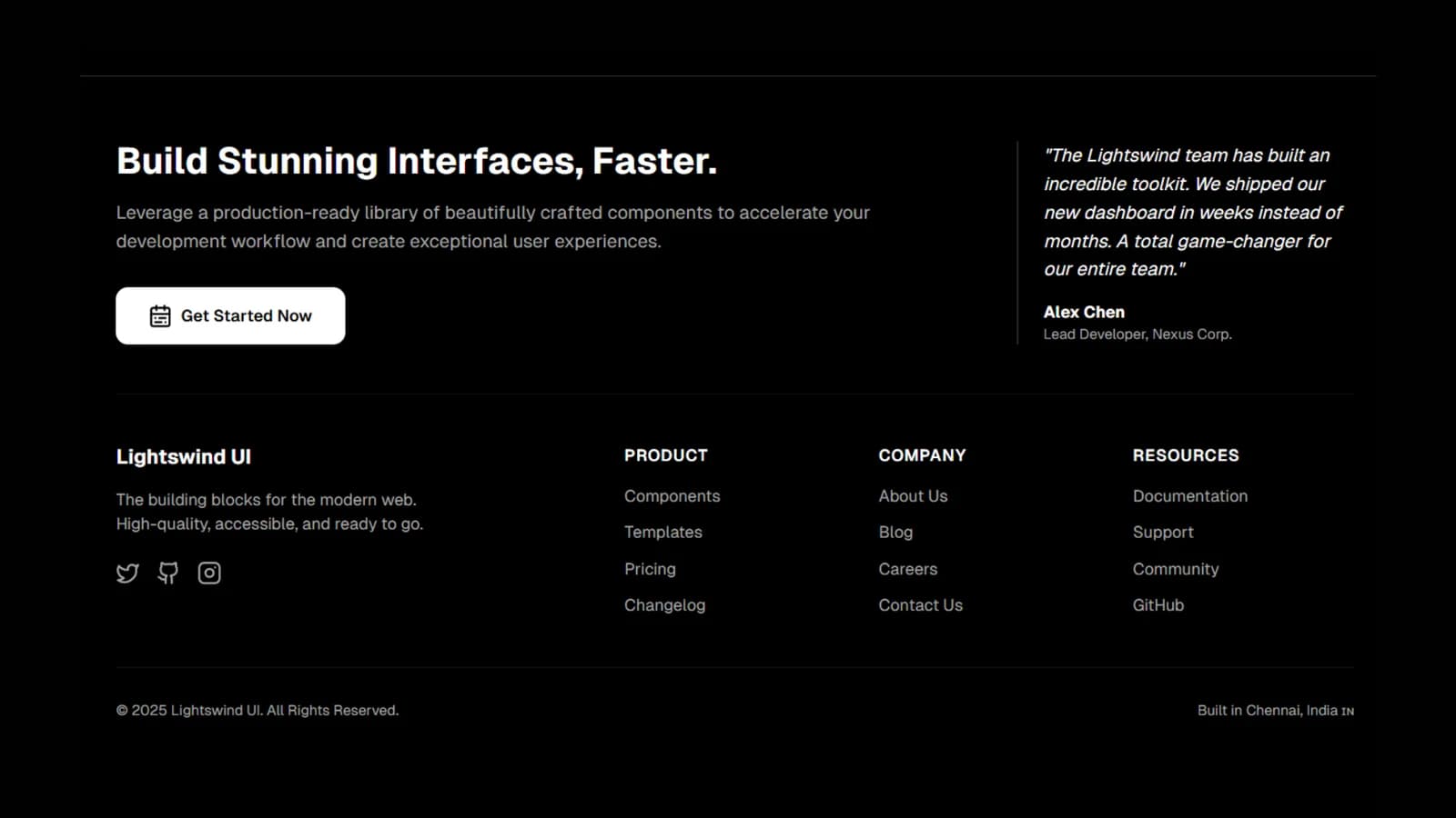
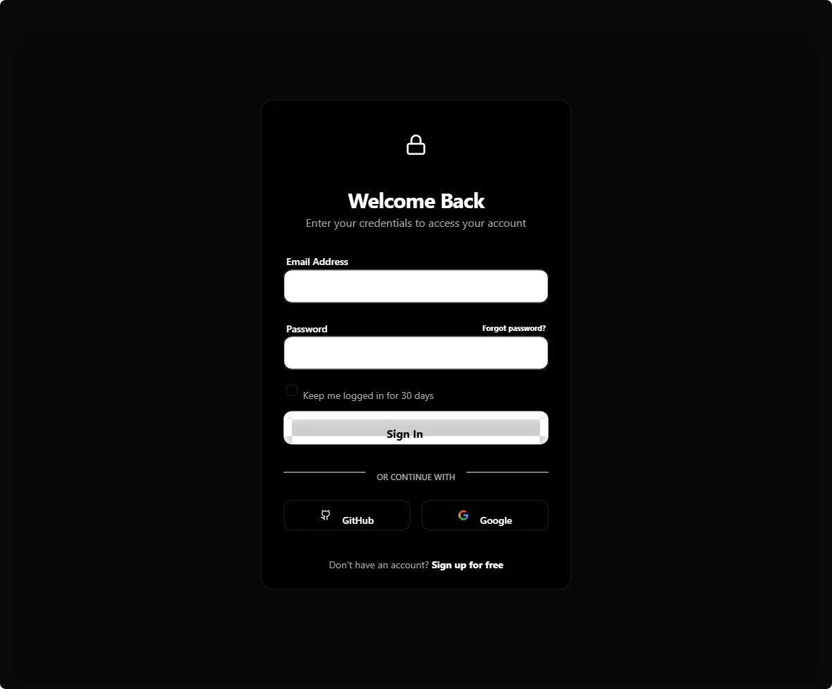
Explore our collection of professional Buttons Groups components for React. Built with Tailwind CSS for easy customization and Framer Motion for smooth animations. Lightswind UI offers 130+ free and open-source components to speed up your development workflow.
Explore our comprehensive library, grouped by utility and function, to quickly find exactly what your project needs.
A product byMUHILAN and Team❤️.